
DISCLOSURE: This post may contain references to products from one or more of our advertisers. We may earn a commission when you use one of our coupons/links to make a purchase.
The Paint Shades to Know — and How to Style Them with Brewers Decorator Centres
A colour inspiration for 2026
Colour trends for 2026 are moving away from one headline shade and towards palettes that feel more adaptable, more emotional, and more lived-in. In Brewers Decorator Centres’ 2026 Colour of the Year roundup, the standout picks lean into comfort and character: blues that feel optimistic rather than cold, neutrals with warmth and depth, and richer tones that create atmosphere without feeling too formal. The common theme is versatility — colours designed to work across different room sizes and styles, rather than demanding a total redesign.
Wall colour sets the mood, but it is furniture and home accessories that decide whether that mood feels balanced, bright, cosy or dramatic. The aim is rarely to match walls and furniture; instead, it is about selecting finishes and textures that complement the paint, or contrast it in a deliberate way. Here are the key 2026 shades referenced in the Brewers roundup, with practical styling ideas focused on the pieces people actually live with every day.
Head to your local Brewers Decorator Centre to order your paint samples today! Visit Brewers Decorator Centre
1. Dulux – Rhythm of Blues
Mellow Flow™, Free Groove™ and Slow Swing™: three upbeat blues designed to slow the pace
For the first time, Dulux has introduced three Colour of the Year 2026 shades as part of one family: Rhythm of Blues. The trio includes Mellow Flow™ (airy and serene), Slow Swing™ (rich and grounding), and Free Groove™ (vibrant and expressive), presented as versatile blues that can shift the feel of a room depending on how they are used. Whether the space is meant to feel calm, connected or more creatively charged, these blues are designed to work as a backdrop that still has personality.
To style blue walls successfully, the most flattering route is to bring in warmth and texture through furniture rather than repeating the colour. Upholstery in cream, oat, stone or pale grey keeps the room open and modern, while timber furniture in oak or walnut softens the coolness of blue and makes it feel more liveable. If you want contrast, add small touches of black through frames, lighting or occasional tables for definition, and then introduce tactile accessories — woven rugs, ceramic vases, linen cushions — so the blues feel layered rather than flat.
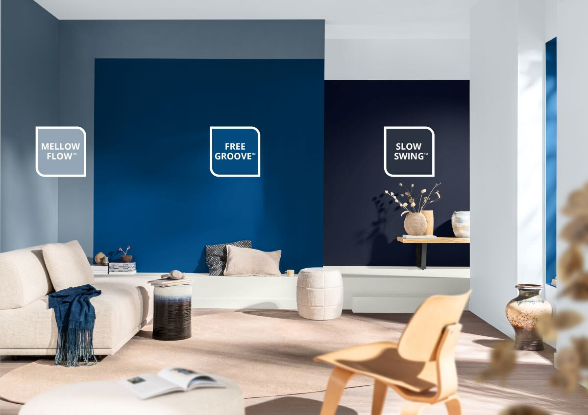
A layered blue scheme shows how the Rhythm of Blues family can create atmosphere without overwhelming a room. Neutral upholstery and pale wood furniture balance the cool tones, while simple accessories add texture and keep the look calm and contemporary.
Fallen in love with Rhythm of Blues? Head to your local Brewers Decorator Centre to order your paint samples today! Visit Brewers Decorator Centre
2. Earthborn – Freckle
A warm, sun-baked neutral that brings softness to both modern and traditional rooms
Earthborn’s Freckle is a warm, earthy shade with an easy, relaxed feel — the kind of colour that makes a room look instantly more inviting. On walls, it adds warmth without becoming heavy, which is why it works particularly well in living rooms and bedrooms where you want a gentle backdrop that still feels considered. It also sits beautifully alongside architectural features, enhancing mouldings and detailing rather than competing with them.
Freckle works best when furniture introduces contrast through tone and finish, rather than more warmth everywhere. Deep green or olive upholstery looks especially rich against it, while darker wood pieces help define the room and stop the palette from drifting into “all one note”. Natural accessories — linen throws, off-white ceramics, woven baskets, textured rugs — add softness, and a few darker accents (frames, lamp bases, side tables) give the scheme structure without making it feel formal.
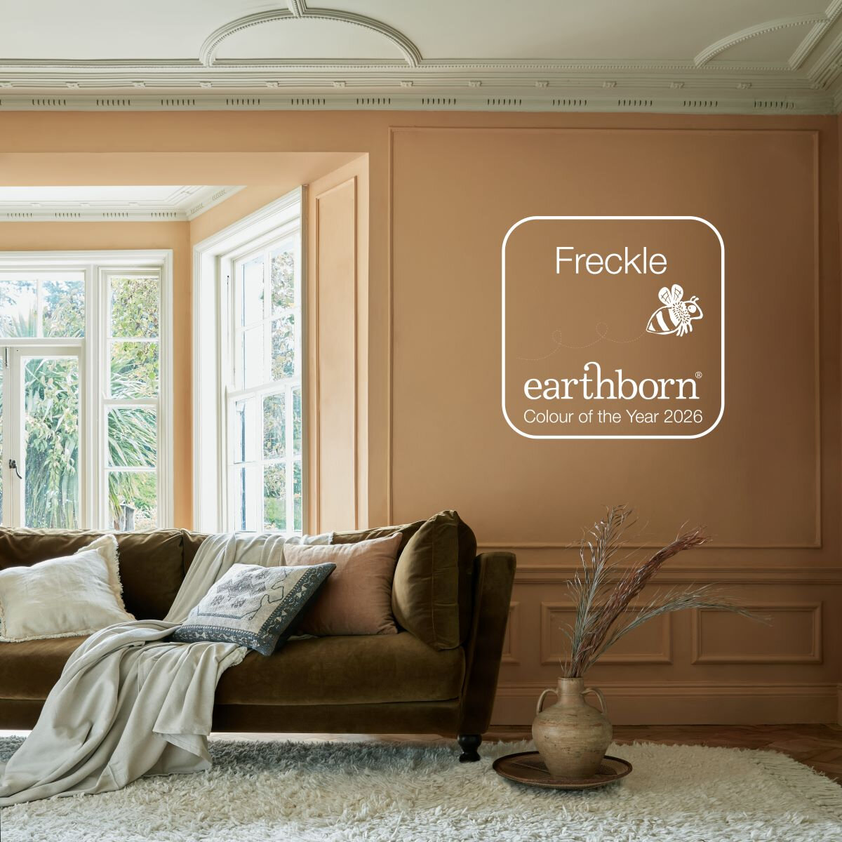
Freckle creates a warm, calm backdrop that flatters period features and soft furnishings. Richer upholstery tones and natural accessories bring contrast and texture, showing how warm wall colours can still feel layered and sophisticated.
Fallen in love with Freckle? Head to your local Brewers Decorator Centre to order your paint samples today! Visit Brewers Decorator Centre
3. Graham & Brown – Divine Damson
A deep, cocooning shade for dramatic rooms that still feel elegant
Graham & Brown’s Divine Damson is a rich, mood-setting colour that instantly changes the atmosphere of a space. Used on walls, it brings depth and intimacy — ideal for dining rooms, snug living rooms, bedrooms, or anywhere you want the room to feel more enveloping and intentional. Rather than reading as “bold for bold’s sake”, damson tones can feel quietly luxurious when balanced with the right finishes and lighting.
The key to styling a deep wall colour is to avoid matching it with equally dark furniture across the board. Lighter upholstered seating — cream, warm taupe, soft grey — lifts the room and creates contrast, while wood furniture in mid to dark tones adds warmth without flattening the scheme. Accessories in brass or aged gold reflect light and soften the richness of the colour, and glass, mirrors and artwork with lighter backgrounds keep the room feeling open and layered rather than closed in.
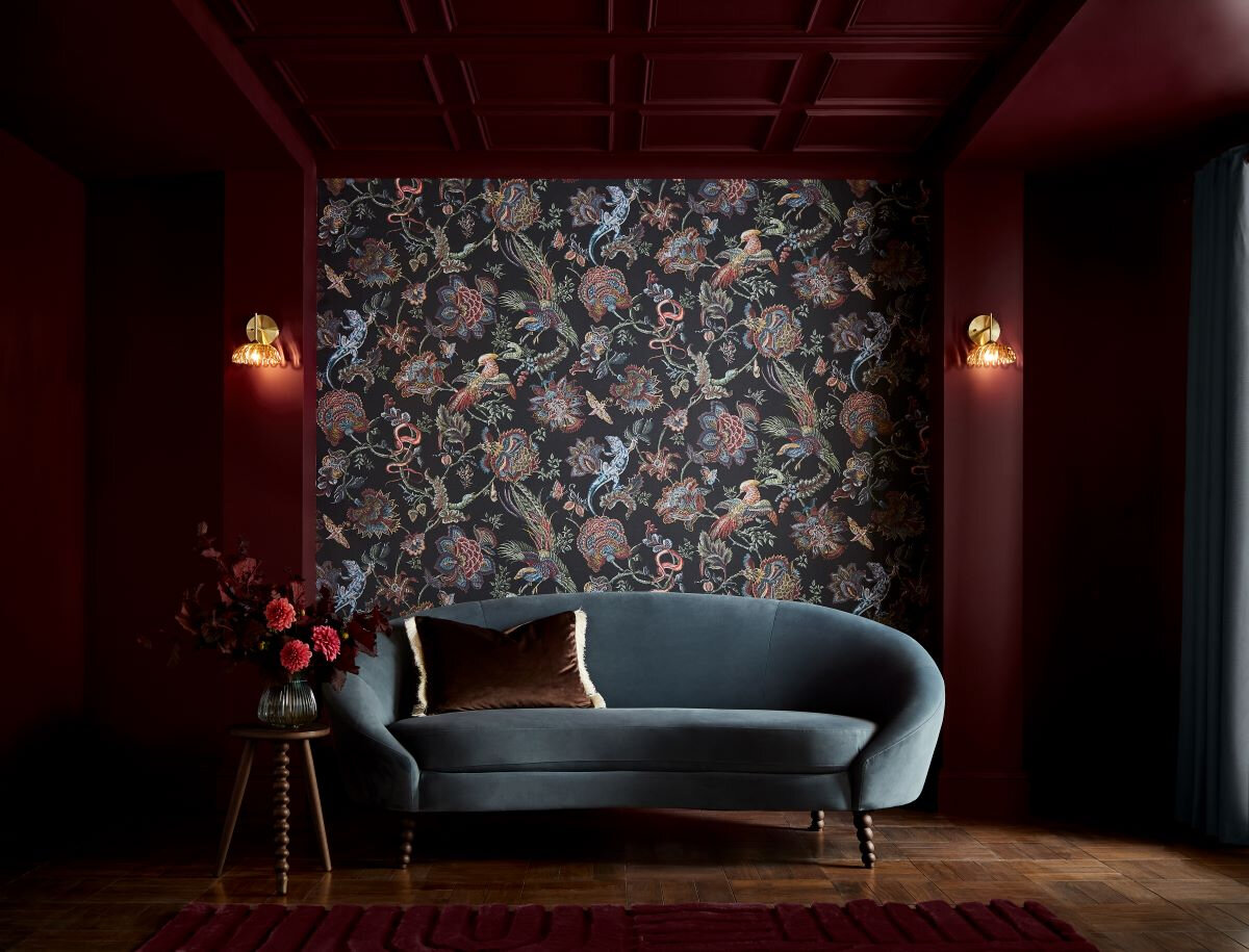
Divine Damson delivers a dramatic, cocooning effect on the walls, made elegant by contrast. Lighter upholstery and warm metallic lighting keep the room feeling inviting, while darker textiles add depth without competing with the wall colour.
Fallen in love with Divine Damson? Head to your local Brewers Decorator Centre to order your paint samples today! Visit Brewers Decorator Centre
4. Johnstone’s – Secret Safari
A yellow-green that blends soothing comfort with subtle energy
Johnstone’s Secret Safari is a versatile yellow-green that brings warmth and freshness at the same time. On walls, it feels optimistic without being bright, and grounded without becoming dull — a combination that makes it particularly well suited to kitchens, dining spaces, hallways and multi-use rooms. It is one of those colours that can quietly change the feel of a space, making it feel more welcoming and energetic without demanding constant attention.
To complement Secret Safari, furniture and accessories should aim for calm contrast and natural texture. Upholstery in cream, biscuit and warm grey softens the colour and keeps it looking grown-up, while pale to mid-tone woods bring a natural balance that suits its earthy edge. Darker accents — black frames, metal lighting, deep wood side tables — add structure and definition, and finishing touches in ceramics, glass and natural fibres keep the overall scheme feeling modern and relaxed rather than themed.
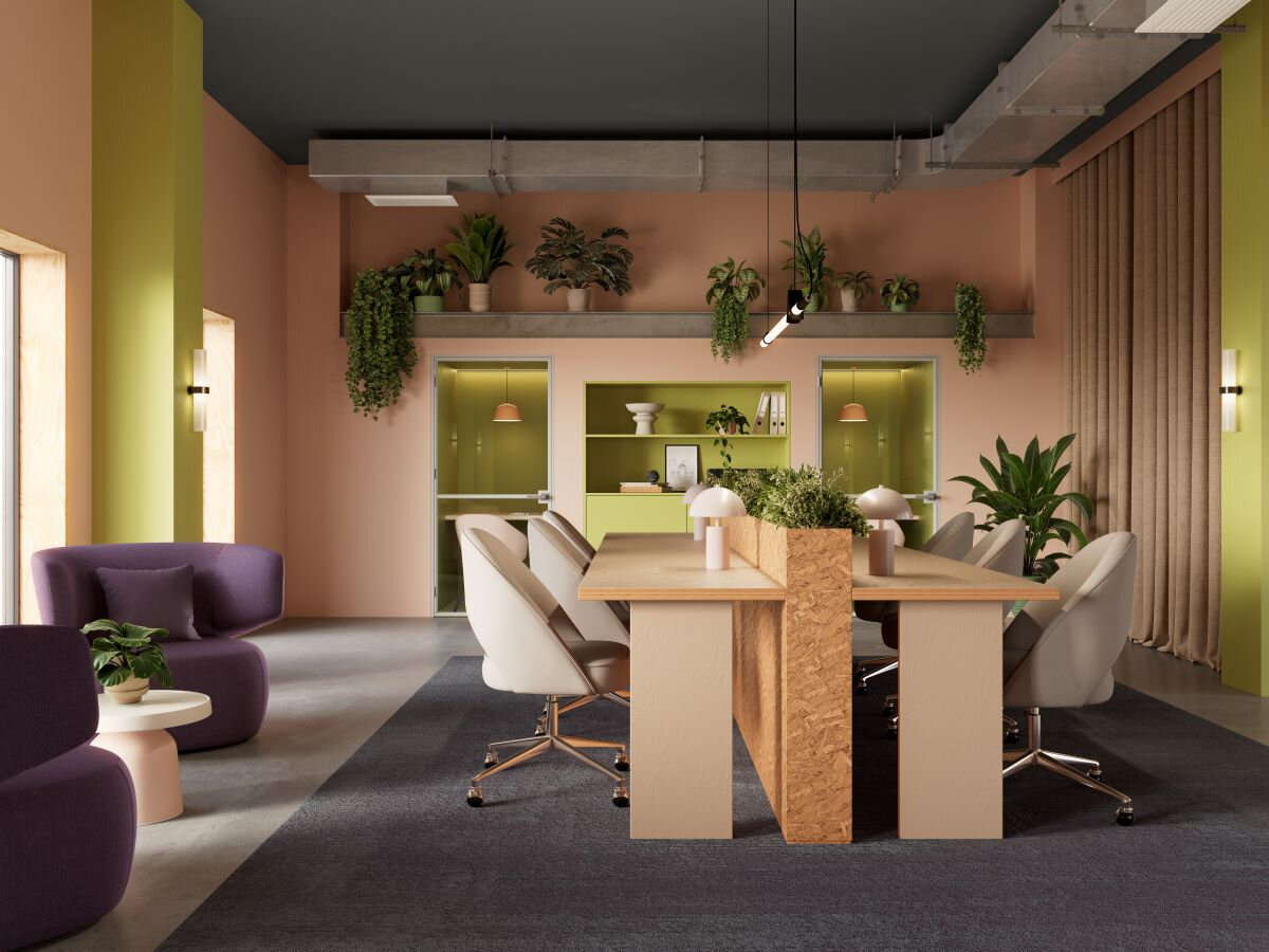
Secret Safari sits beautifully between warm and fresh, bringing comfort with a subtle lift. Pale furniture and natural materials balance the wall colour, while darker accents add structure and stop the room feeling too sweet.
Fallen in love with Secret Safari? Head to your local Brewers Decorator Centre to order your paint samples today! Visit Brewers Decorator Centre
5. Espresso and Deep Browns: A New Kind of Neutral
A deep, modern neutral that creates instant depth
Benjamin Moore’s Colour of the Year for 2026, Silhouette AF-655, is a deep espresso-brown that sits comfortably in the space between contemporary and classic. On walls, it creates instant depth and definition, particularly in hallways, dining rooms, studies and snug living spaces where you want the room to feel grounded. It reads softer than black and warmer than charcoal, which makes it a powerful “new neutral” for 2026 — rich, but still easy to live with.
The most effective way to style a dark brown wall colour is to use furniture and accessories to introduce light, contrast and texture. Lighter upholstery in cream, stone, camel or warm taupe prevents the room from feeling heavy, while pale rugs and natural fibre runners add breathing space. Dark wood pieces can still work, but they should be broken up with texture — leather, woven details, matte finishes — and balanced with reflective accents like mirrors, glass lamps or warm metal hardware so the space feels layered and intentional rather than flat.
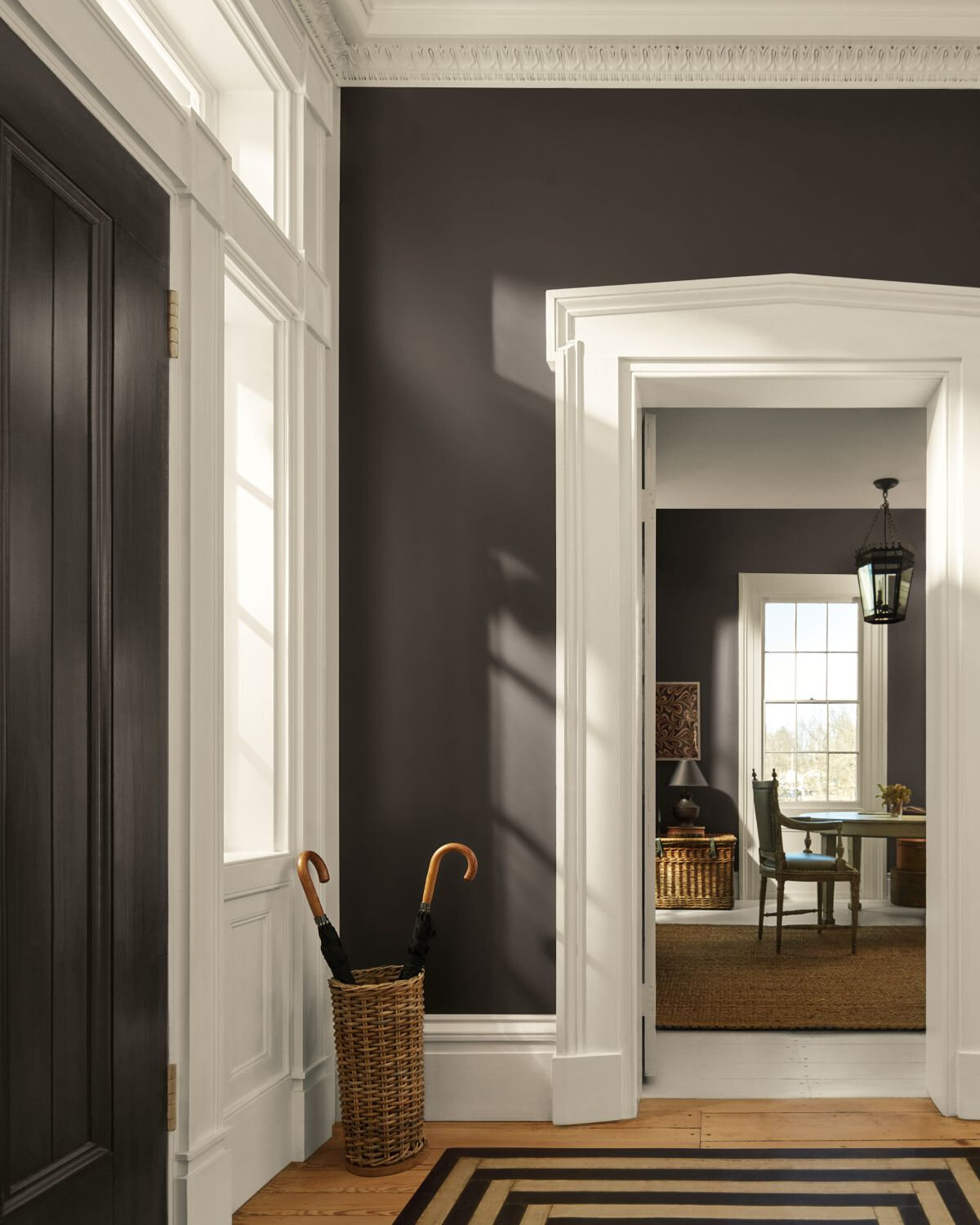
Silhouette AF-655 shows how a deep espresso wall colour can feel warm and sophisticated rather than stark. Crisp white woodwork and natural textures bring contrast, while darker details add definition and make the space feel considered.
Fallen in love with Silhouette AF-655? Head to your local Brewers Decorator Centre to order your paint samples today! Visit Brewers Decorator Centre
6. Mylands – Burlington Arcade™ No. 216
A richly nuanced hue that creates a timeless, elevated environment
Mylands Burlington Arcade™ No. 216 is a deeply nuanced, heritage-leaning shade that feels both timeless and modern. It shifts between blue and green depending on the light, which gives a room depth without needing pattern or additional colour. On walls, it creates an immersive backdrop that works particularly well in bedrooms, living rooms, and spaces designed for evening comfort — rich, settled, and quietly confident.
Because Burlington Arcade already carries so much depth, furniture should add warmth and tactility rather than more intensity. Warm upholstery tones — cream, camel, tobacco leather — look especially refined against it, while darker woods such as walnut add richness without making the room feel heavy. Brass or antique gold finishes bring a soft glow, and layered textiles (linen, velvet, textured cushions, rugs) ensure the room feels lived-in and welcoming rather than overly formal.
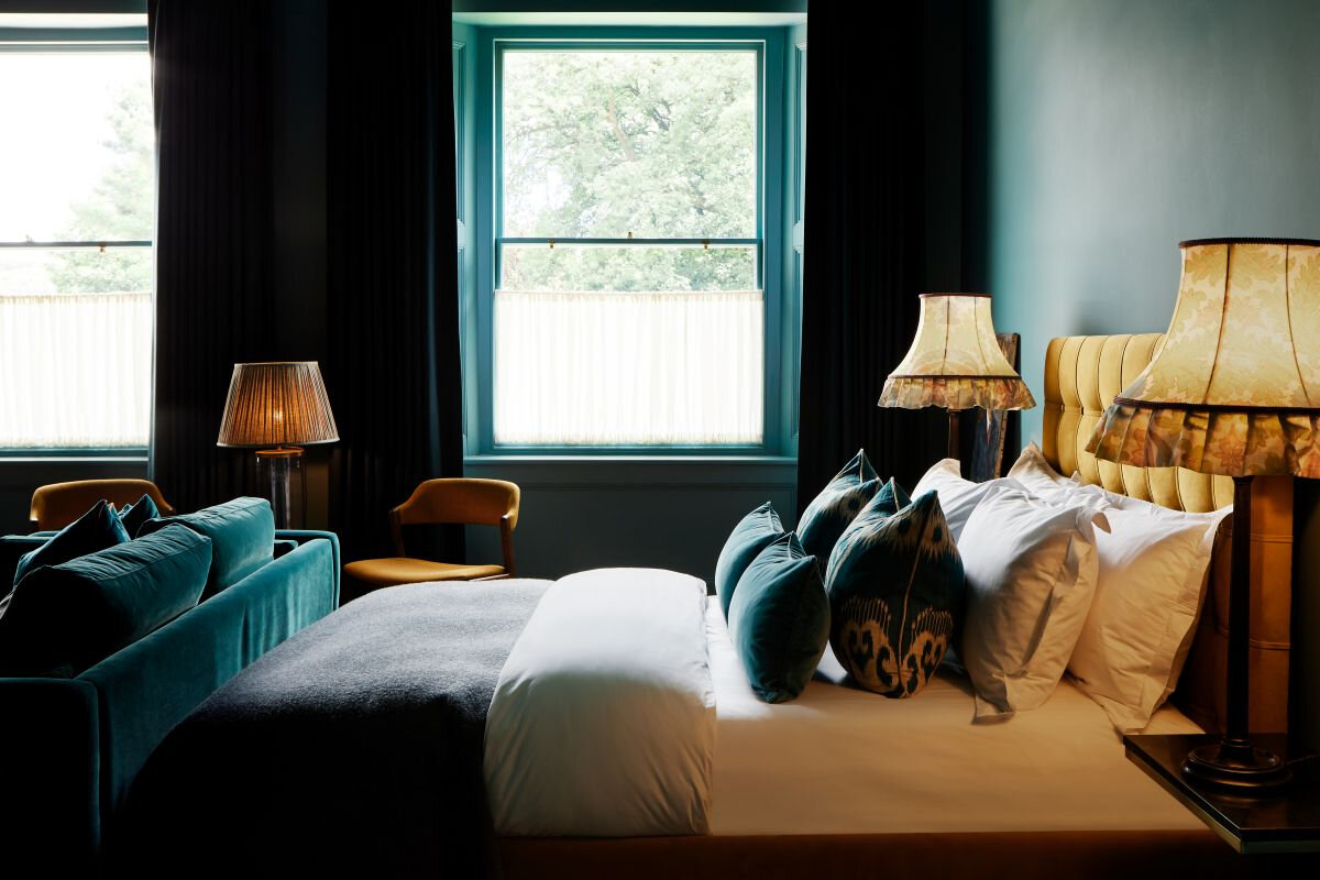
Burlington Arcade™ No. 216 creates a deep, atmospheric backdrop that feels timeless rather than trend-led. Warm upholstery, layered textiles and classic finishes soften the richness of the colour and make the space feel inviting.
Fallen in love with Burlington Arcade™ No. 216? Head to your local Brewers Decorator Centre to order your paint samples today! Visit Brewers Decorator Centre
Styling Note for 2026: Contrast Beats Matching
Let the walls set the tone, then use furniture to shape the room
One of the clearest design lessons from the 2026 colour selections is that the best rooms do not rely on matching walls to furniture. Instead, they build harmony through complementary neutrals, contrast through darker accents, and warmth through natural materials and texture. This approach also makes it easier to refresh a space over time — keeping the wall colour as the mood, while furniture and accessories evolve around it.
If you are choosing one of these 2026 shades from the Brewers roundup, consider how you want the room to feel first, then select furnishings that either soften the paint colour or sharpen it with contrast. A calm wall colour can handle richer upholstery, a deep wall colour needs lighter furniture to breathe, and a fresh yellow-green looks best when grounded with neutrals and wood. When paint and furniture are considered together, colour becomes less of a trend and more of a long-term design decision.
Fallen in love with a colour? Head to your local Brewers Decorator Centre to order your paint samples today! Visit Brewers Decorator Centre